Mainnet
Unichain
Logo
01Full (Horizontal)
This is the primary logo that is most recognizable. It works well in most environments. The vertical version is available when space is constrained or limited.
Full (Vertical)
This version of the logo is available for instances where space is constrained or limited.
Logo
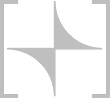
It's called an icon because it's iconic. It's simple and can be used as a shorthand for the Full logo.
Typography
02Basel Grotesk
Our primary typeface. Rooted in modernist typography, Basel Grotesk reinterprets key elements of this aesthetic with a new dynamism.
AaBbCc
Riegraf
Used for emphasis. With its high contrast strokes and fusion of geometric and calligraphic models, Riegraf adds personality and echos the tapered tips of Unichain's icon.
AaBbCc
Color
03Pink
It's Unichain's primary color and secondary color — that's how strongly we feel about it. Pink is what people associate with the brand and makes Unichain instantly recognizable.
Black, white, and greys supplement our pinks. Black and White can be applied to the logo when additional contrast is necessary.
Concept
04The Graph
Rooted in the origins of the Uniswap Protocol (even before the Unicorn) is the x*y=k formula that powers the AMM.
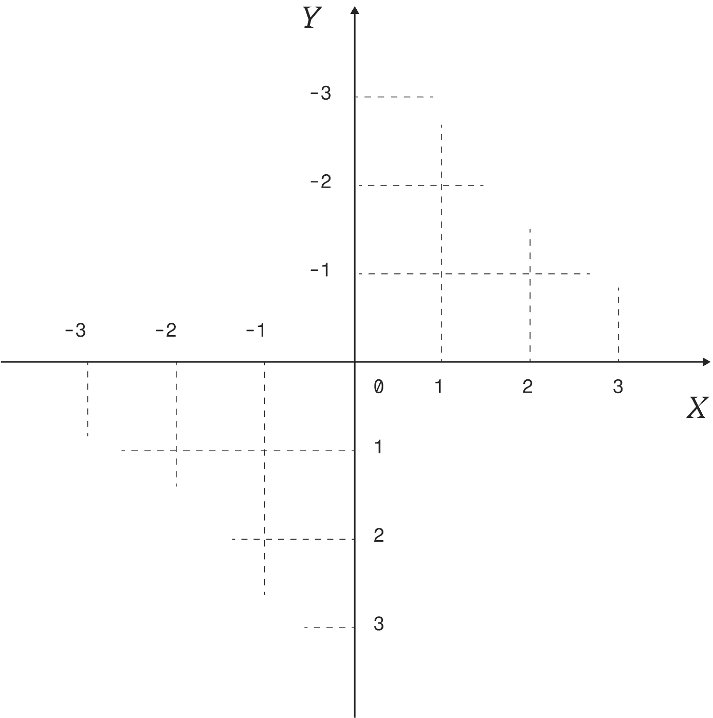
Fig. 1
Partners and Community
The grid comes to life with color and interactivity — revealing shapes that represent users, assets, projects, apps, and networks that call Unichain home.
Fig. 2
Logo Guidelines
05Do's and Don'ts
If you're ever tempted to try something creative with this logo — don't. Channel your creative spark into whatever the logo will live on instead.
Use only the official logos
Use the icon in brand colors only
Network icons use white icon on pink background
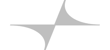
Don’t stretch or skew the logo
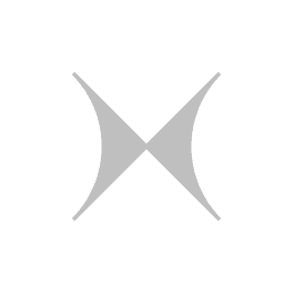
Don’t rotate the logo
Don’t place other elements too closely to the logo
